Oh shit now you did it. About a week ago I gave rd95 an absurd quest: To find some horror comics from the late '60s or early '70s, look in the back for a page that was nothing but head-shop posters, and find me the one that looks like a dude sitting alone in a crystal labyrinth. It is an image seared in my brain thirty or more years ago, the most striking vestige of a collection of horror comics I inherited from my cousin Larry and sold wholesale two years later, a time capsule from another era I had not quite forgotten. It is an image I have looked for off and on for twenty or more years, the "holy grail" poster of my past that I have never been able to let go of. I promised him an assortment of mid '60s Popular Mechanics from my deceased grandparents' house as reward. It took him half a day. This is the past future that defines me: a semi-absurdist pop-culture future in which nuclear annihilation is a foregone conclusion and that which comes later will be gacked to the nines and spired out like Metropolis. It doesn't help that I've effectively retreated into No Man's Sky to get away from my neighborhood. The future, as presented by No Man's Sky, belongs to Ralph McQuarrie and Syd Mead, not Jony Ive and Dieter Rams. It is a messy lines-of-coke, acoustic-coupling, MICR-E13B future where n times apple times pear equals three and where the driving ethos is wonder, not smug self-satisfaction. You know what has always bugged me? I can get this shit all day: But apparently no one has even thought of selling me one of these. It's funny - twenty five years gone and I find myself nostalgic for ugly shit. Say what you will about the Soviet design bureaus, they had an ethos. _____________________________________________________ I think we're turning a corner, though. I've been in the market for cars and there are an astonishing number of boring ones out there. But at the same time, the Japanese are apparently feeling their Akira. Just in the past year we've gone from this: to this: And from this: to this: and while five years ago the articles were all "ZOMGJONYIVESQUEEE" they're now all "FANBOIHURRRGHWHARRRGARBL" and aside from the exquisitely dull world of personal electronics, things might be going the other direction. One need only look up "LED chandelier" to see that the Pacific Rim is not waiting for us. And I embrace their adventure.


I feel ya. In the case of Apple, it is clear they continue to be guided by: cool > warm smooth > texture delicate > robust light > heavy bare > detailed However, they have retired these principles: whimsy > seriousness object > item Apple used to stay interesting because they made whimsical and bold objects like the Macintosh, the clamshell, the iMac, and the iPod. They have always had products in derivative phases of evolution, but now their entire product line has converged into a state of derivation, so much so, that they are obviously sacrificing UX for form factor. The only way that this might be ok, is if their software experience didn't feel like it was on exactly the same course, but it is on that course, and it is getting worse. Apple products have very little soul. They have gone from Next Generation to THX1138. I would argue that we have been suffering sleekness for so long, because Pottery Barn is so much cheaper to produce than Rococo. For most of human existence, ornamentation was a sign of wealth and taste. Sleek and shiny objects and buildings are only nifty when they are an expression of new technological and material possibilities symmetry > asymmetry bold > cautious
It comes over to me as more of a plea for personality in design - or at least, that is the part that resonated the most with me. Which might explain the urge that I always have with devices like Apple's, where I just have to alter them to make them my own.
The days of risk taking seem dead. As long as quarterly reports keep showing there is money to be made not much is going to change right? Before we start focusing on design, I would honestly just love for shit to work the way it should. Why do I feel the pressure to change phones so often? Seriously why does the same shit come out every single year? To me its unbelievably infuriating that the price of these machines are growing, but the features I'm being given access to are not expanding in any real sense. Instead, I can pay 300 dollars for a galaxy note 7 (that could potentially blow up in my pocket) to literally scour the entire phone to find all this garbage on it I don't actually need. It will come with an even more ridiculous UI than the last iteration with features that are cool, but of no real use besides degrading my battery life quicker than before. After a year or two of all these "features" and "updates" my phone begins it's slow painful death, where I am prompted again by advertisements on why it will be better with the Galaxy Note Infinity. Before we worry about how all of this shit looks, can we at least make it work right...
I mean most are stuck in the cycle at this point. Phone's are not made to survive, and anyone who last too long is pushed out through the use of software updates or just lack of support from the manufacturer. You can either keep up with the times or just be left without a functioning phone. The whole non-removable battery cell phones really pushed that along by a lot. I don't actually own a Galaxy Note 7 by the way hahaha.
There is minimalism, and there is minimalism. I completely get where the article is going, but the design aesthetic of the last 10 years, lead by companies like Apple, does not encompass all of "minimalism". Not by a long shot. Yes, there is definitely a move away from the contrived set of glossy surfaces, bezels, curved corners, and plastic and chrome which characterise most Apple products recently. I think that's a good thing. For example, look at this and tell me it doesn't make you drool: It would have looked odd 10 years ago. Now, it looks futuristic again. More to the point, retro-futuristic. kleinbl00's comment about embracing the Akira (and Bladerunner) kind of thing definitely has legs. In a way, we've been living in a kind of Jetsons-esque world, a 50s american futuristic view, where everything is molded plastic and rounded and smooth. I'm more than ready for beautiful lines, the stylings of 60s and 70s futureperfect and the minimalism of the 60s to take a hold. Personally I'm refurbishing a flat right now, and I'm really taken with the 60s minimalist aesthetic - Eames and Wassily chairs, minimalist clean-lined leather sofas, large wood tables with interesting geometries, futuristic lighting. Here are a few examples. Sandstone and blue and white colours. Natural material with clear lines. Carbon-fibre. It doesn't have to look like Akira, but it's going to be a new minimalism and be cool as hell.

_BLBLCK_FZ.jpg)


The market wants what the market wants. And Apple, for reasons that I still don't fully understand, drives a large portion of what the market wants. I think the earpods are ugly as sin, but I guarantee there are already a slew of pro-Apple articles written that are hailing them as the greatest invention since the wheel, and even more of them will be released as people have to defend their idiotic $200 purchases. I would much prefer the black-and-gold neo-victorian look. Once I upgrade from the Galaxy S4 I have now, I'm planning on getting a giant, chunky several thousand milliamp-hour capacity battery case, so that I don't have to constantly be thinking about my usage. Give me a brick of a phone, as long as it does the things I want it to do.
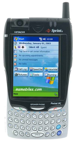
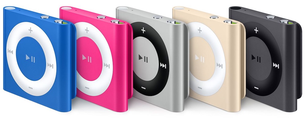
My fundamental beef against Steampunk is that it celebrates an era of elitism and social inequality through the false over-ornamentation of everyday objects. My beef against giant chunky phones is they have to fit in a pocket. I mean, I had one of these. Which, granted, was smaller than one of these.
I have a three or four year old smart phone that I'm waiting patiently to die so I can replace it without feeling guilty. The other day when I was thinking about replacing it I remembered phones from the early '00s. Candy bar phones, flip phones, those nifty little sliders. Half of those things were pretty cheap, but the other half lasted forever, andany had nifty features like built in bluetooth, the ability to play MP3s, and even a camera of you were willing to splurge. The form factor was as much of a selling point as anything else, they were fashion statements almost. Now we have all of the features we could want and none of the cool form factors. It's nice in a way, cause we don't have to make anywhere near as many compromises. Still, I kind of miss buttons.
I'm on Fi right now. Don't know what your time frame is, but I'm sure it's worth waiting until the new HTC phone comes out (forget what they're calling it--not Nexus). The Nexus 5X is ok, but it's kinda cheap. Having never seen the HTC phone, I can still almost guarantee it will be nicer. Also, you get $150 discount on the handset when you sign up for Fi. You may already know that, but it's not heavily advertised if you just go on the Nexus page. I almost bought the phone then signed up for Fi, because I didn't know any better.
Yeah, been looking at that. Good tip about the 5X 'cuz I was going to saddle my wife with one. Apparently the specs between the Nexus 6P and the "Google Pixel XL" are pretty damn similar so I was thinking of jumping on it... but if the 5X is plastick-ey we'll hold off. Assuming my wife's iPhone survives another month. A friend tried to order the new iPhone in blacker-than-black. It wouldn't let him. "mostly black" was due end of November. Ridiculous.
The slaves in the apple aesthetic (God I hate myself for using that word) are Chinese instead of Cornish/Welsh, and are better concealed. At least Victorian aristocracy didn't pretend to give a damn about the proles. The Apple aesthetic is the inverse of the over-ornamentation, no? I'd happily take a TI-85 sized phone if it meant a few days of battery life, and a high capacity hard drive.
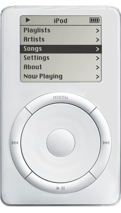
The Apple aesthetic is actually the Dieter Rams aesthetic and, on its own, is a useful and worthy design philosophy. Where Apple fails is that 3, 5 and 7 have superseded 1, 2 and 4. This is because Apple is more interested in shit looking cool than in shit being cool because, in my opinion, they have reached a point where they will not convert more people to the fold and are instead attempting to maintain marketshare through paeans to the past. The iPod - as originally conceived - was revolutionary. Note that there are five buttons and a scroll wheel, which allows the user to parse an XML file and operate on it in two directions. It gives visual feedback and tactile feedback. It has a hardware lock switch, an industry-standard charging port and a display large enough to accomplish its designed task and very little more.


