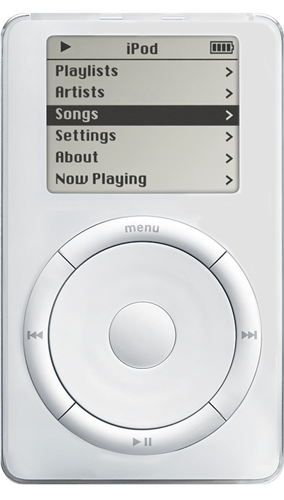
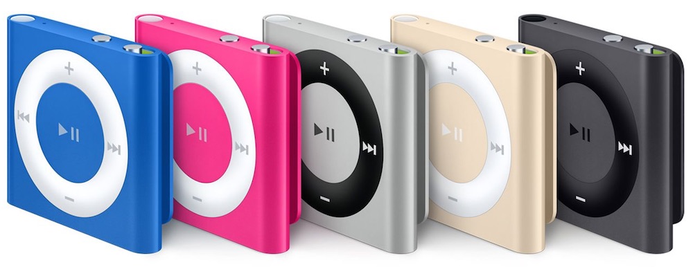
The Apple aesthetic is actually the Dieter Rams aesthetic and, on its own, is a useful and worthy design philosophy. Where Apple fails is that 3, 5 and 7 have superseded 1, 2 and 4. This is because Apple is more interested in shit looking cool than in shit being cool because, in my opinion, they have reached a point where they will not convert more people to the fold and are instead attempting to maintain marketshare through paeans to the past. The iPod - as originally conceived - was revolutionary. Note that there are five buttons and a scroll wheel, which allows the user to parse an XML file and operate on it in two directions. It gives visual feedback and tactile feedback. It has a hardware lock switch, an industry-standard charging port and a display large enough to accomplish its designed task and very little more.

