In the first #letsdoit post, I said I was going to do some photography. This afternoon, I grabbed my camera, threw my bag over my shoulder and headed into the creek by my house. Here's what I got from it.
Photo 1
After searching around for a good 20 minutes, I finally found my way down to the creek bed. I hadn't been down there for years, and apparently, nobody else has either. Many of the old paths that I took as a kid were overgrown and nonexistant. Luckily, there was one that people still commonly enough for there to be a trail, so I hiked down the path and came to a little runoff that took me right next to the water. I walked a little bit, found a nice spot to set up my tripod and set my viewfinder on the hill next to me.
This is the first picture I took, and I think it's the best one I got today. With a quick touch up, I got to bring out the cool vibe that the overcast sky put on everything. I think I did a pretty good job of capturing the brightly colored brush in the center of the picture. However, I think in my attempt to get the water in the picture, I cut it a bit short and got too much creek and not enough water.
Photo 2
I heard a car going across the bridge, so I looked over. What I saw was something I really liked.
On both my left and right, there was this massive amount of overgrowth. In the middle, there's this little peak at the red bridge that goes into my neighborhood. I thought the red in the center of the greens made a nice juxtaposition, as well as created a nice "man vs. nature" kind of dichotomy.
The overcast sky came out as pure white, so I kind of mapped everything to compliment it. I was going to temper it kind of cool, so it would give off an "abandoned" kind of vibe, but I liked the more lighter feel to it. Now that I think about it, I might go and try that (Edit it here?). I wish the bridge was a little more in focus, so guess I have to play with my aperture settings.
Edit:
Here it is
Photo 3
I looked up to the sky to take note of what kind of light I was working with, and caught a glimpse of a single tree branch sticking out from the rest. I really liked the contrast of the vibrant tree leaves against the cold, grey sky, so I grabbed the tripod, swiveled the head towards the sky, and took a picture.
In Light Room, it looked a lot better. It seemed like there was a flat white in the background, but now I can see there's a bit more blue to the sky. Even then, I kind of like it. Maybe I should go back and solidify the white?
I dabbled a bit in the past - mainly taking pictures of trips and stuff, but this is the first time I went out to solely take pictures. That's why I'm counting this as day 1. I've been taking the pictures manually for a while now, so this isn't all auto-focus magic.
Any thoughts?
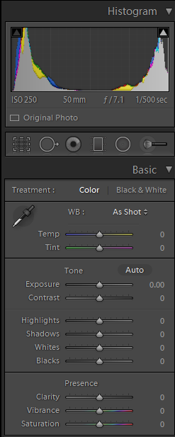
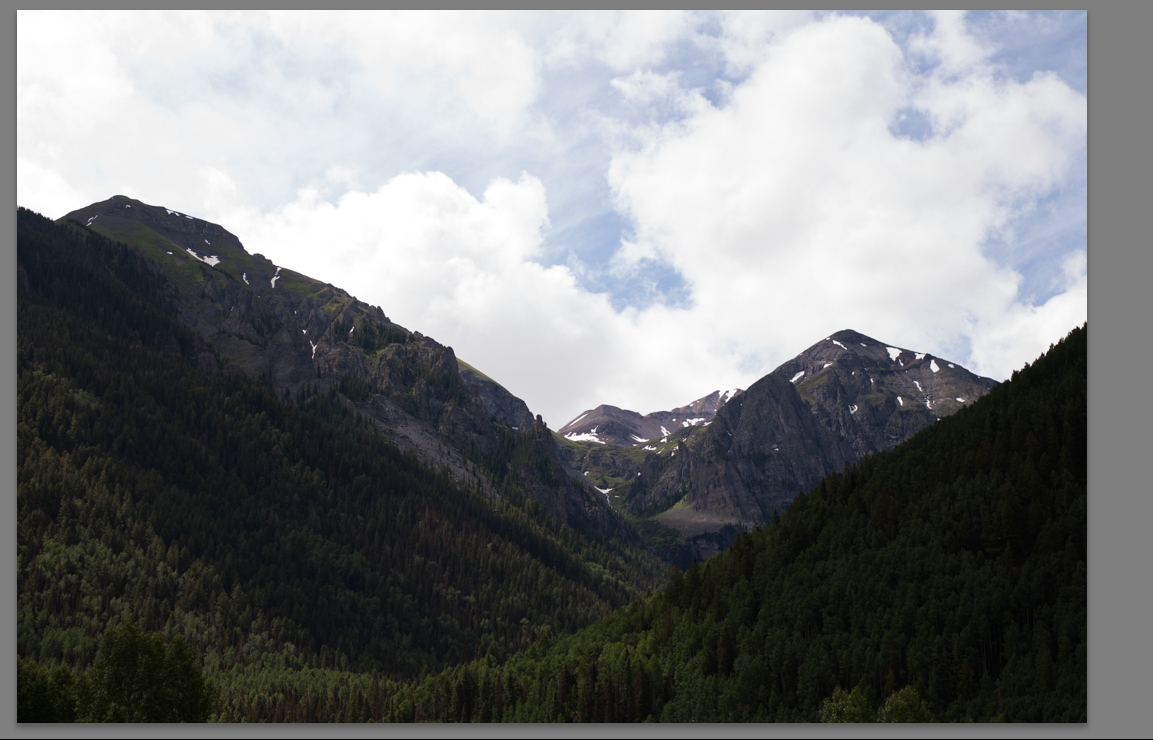
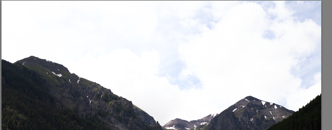
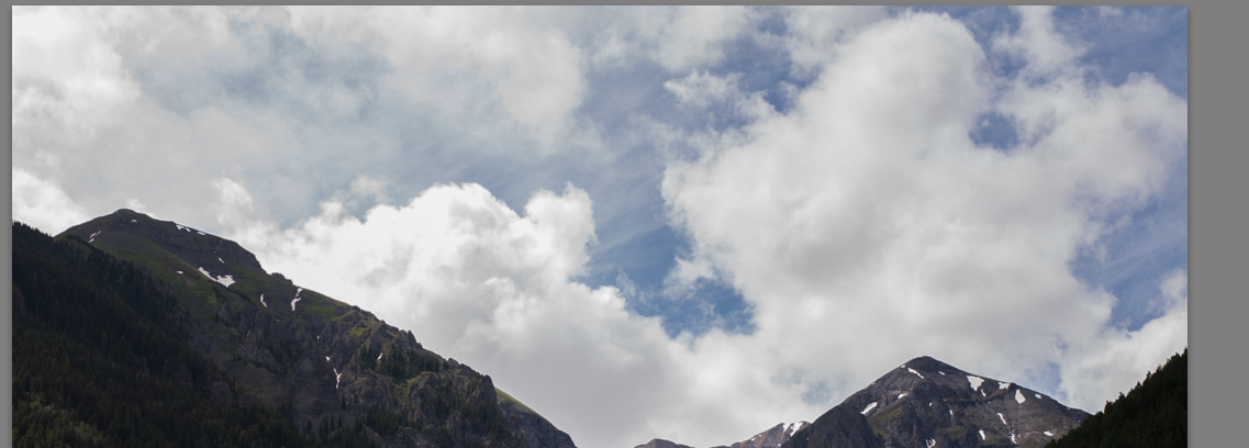
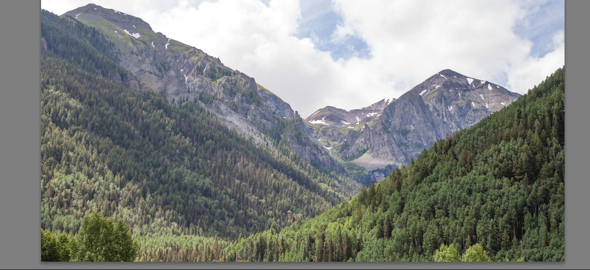
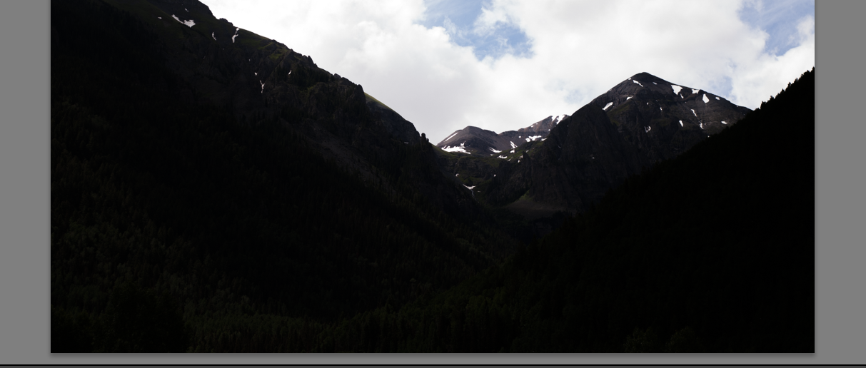
Hey! #letsdoit is awesome. Quick something. When you use lightroom (or really any editing software), there's a thing called the histogram. In the basic develop tab you should see, under the exposure and contrast, more sliders which will let you fine tune exposure for different portions of your image This is an image I had on hand, let's use it: This: will let you change the image's 'whitest' values - here, the sky. Highlights +100: Highlights -100: Or you can use Shadows for the darker parts of your image. Shadows +100 Shadows -100 hope this helps! It'll let you control each part of your image (sky background, leafy foliage foreground) a little better.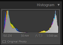

I can feel the enthusiasm for what you're doing in your writing here. I know nothing about photography proper, but looking at the photos from an artistic standpoint i can see a lot of things I like. In particular, I can see myself using Photo 3 as a background. I hope someone comes along with good advice, but I can at least provide encouragement - Keep it up!
I also like photo 3. It's the best composition of them all imo. Super_Cyan: The bridge shot is an interesting focal point, but I wouldn't put it square in the center of the composition. I would have it off center. That's just me though. Maybe have it more to the left of the photo with more of that tree on the right taking up the middle. This would give the bridge a sense of having "somewhere to go," and give the shot more space too. I like the water in the first shot. I might have focused more of the composition on it. Though I do really enjoy the green colors you got. Keep the photos coming, I enjoyed looking at them. I bet it was a blast to get out there and create them. Nice work Super_Cyan!
I really got the same feelings coffeesp00ns got in your post. I can certainly see an artistic side to this and I really hope you continue on your path learning and learning. We could see you posting about how you're entered in a photography contest or photography art gallery before we know it!
Looks good! Number three went up especially gloriful. If you are going to dabble with number three's white, think about evening the tree brightness level as well. It would make it more surreal, but will add to the beauty of the composition, if such a feeling is what you're going for.
Photo 1 is good! I love the gnarly root. I would have tried to focus on it a little more and included all of the branch coming off of it. I'm also loving the colors coming off of those rocks! I like the colors in the first photo of the bridge more than the second. And you should totally go back sometime and get a vertical shot of the water and line of rocks leading up to the Bridge. And for the last photo, I see what you mean about the branch having great contrast with the sky. I would turn that one black and white. That green color is nice, but with it black and grey the contrast with the sky would pop even more. Plus, it would be a quick way to take all the blue out of the sky. Cool set man, thanks for this. #letsdoit can do some good still. I've been looking for motivation to pick up my camera again.


