An aesthetic of minimalism in architecture and interior design has been sold to consumers of high design for decades now in the pages of Dwell and the endlessly scrollable interfaces of websites like designboom and ArchDaily.
If Kate Wagner had ever actually practiced architecture she'd know how much bullshit she shovels on the reg. Let's look at two pictures, shall we? You can find them yourself. Do a google image search of "sweatshop." Ignore the people - I mean, don't ignore them but for purposes of aesthetic comparison, look past them - and focus on the floor. Focus on the windows. Focus on the ceiling. Great. Got your head wrapped around that? Awesome. Now do a google image search of "trendy loft." Again, ignore the furniture, focus on the floor, the windows, the ceiling. What do you see? SoHo became a hip fashionable district because it's where Andy Warhol and the Velvet Underground were able to squat thanks to the collapse of the Garment District. The same is true of any American city - everywhere that had tailors and made clothes ate shit between 1960 and 1980. So the space was cheap, the neighborhood was bohemian, and wealthy white boomers were able to colonize Jewish and Spanish enclaves. It was the It Thing and you can extend it to the Continent, too but we're talking Americans here. Ahhh, but what if you don't have a loft? What if you're renovating a restaurant or a retail space or an office? Well guess what Junior if you strip out the shitty '70s carpet and busted-ass fiberboard drop ceiling you have the exact same fuckin' space. Lofts are what construction looks like before you make things livable. They're loud, they're drafty, they're uncomfortable. So if you've got your fancy-ass restaurant, but you want it to look bohemian, you get to spend an ass-ton of money on the furniture. You get to throw in gobs of exposed ductwork. Skin the walls in gyp so that you don't see the conduit? PERISH THE THOUGHT! buy the special polished conduit so it looks like we did it on purpose! I used to get two or three of these calls a week - 'cuz, see, I actually practiced as an acoustician instead of just getting the degree. It would be whatever the It Thing restaurant was last month or the month before, noticing that their receipts were down a little and wringing their hands about how their reviews contained the word "loud." We'd go out, look around, and say "you know all that carpet and ceiling tile you ripped out? Put it back." And they wouldn't because that isn't The Look so now we all sit around shouting at each other because the corner coffee shop has the same acoustic profile as a grain silo. That's why these places are always empty, too - the walls and ceiling are so busy that if you don't put in stark, basic furniture they look like the warehouses they are. And you have to walk around and speak in hushed tones because your every fart reverberates down the hall to the next 22' ceiling converted loft space. They're fundamentally unlivable - I know several people in LA attempting to make them work. But because they photograph quite nicely they shall be all the rage until someone hip sets up shop in an Orange County "mcmansion" at which point we'll all have to deal with Hunter Green and beige cut pile again.
Wagner would agree with all of your criticisms of loft spaces as "unlivable" and loud. This was probably one of the first articles I'd read from her: https://www.theatlantic.com/technology/archive/2018/11/how-restaurants-got-so-loud/576715/
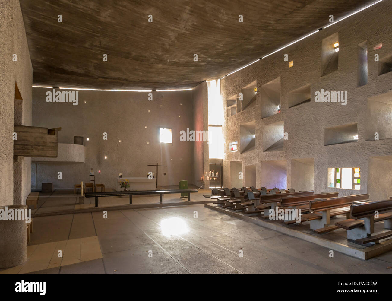
She's still trying to blame it on design. Here's Le Corbusier's Ronchamp: That's pretty much peak "minimalism" - Courbusier, 1955. It's peak starkness: that's a frickin' chapel, designed to reverberate. And it's got a curved ceiling and a textured plaster wall to knock down the noise. Boston Symphony Hall is basically a loft with filigree and it's the most famous application of Sabine's acoustical expertise. Kate Wagner really wants to blame DESIGNERS for shitty architectural experiences and trust me: there's plenty of blame to go around. The problem is, every example she highlights as a failure is an owner or a builder cheaping out while every example she highlights as a success is an architect telling their clients to shut up and like it. She's a shithead that didn't pay attention in class and couldn't get a job with the same meaningless degree my boss decided to get through distance learning, despite the fact that a year into it she discovered she usually spent her time arguing with her professor about math. And my boss's degree was in interior design.This trend is not limited to New York. According to Architectural Digest, mid-century modern and minimalism are both here to stay. That means sparse, modern decor; high, exposed ceilings; and almost no soft goods, such as curtains, upholstery, or carpets.

My beef with Kate Wagner Once upon a time, back when Kate Wagner was likely in high school, there was a blog called "It's lovely! I'll take it!". It was a bored housewife in Seattle poring over Redfin and seeing a lot of white lawn chairs in inappropriate places. She attracted a following, they pored through their real estate listings and the funny ones got shared. It was popular enough to get sold to Cheezburger, who ran it into the ground, and the whole thing collapsed in 2013. Unhappy Hipsters followed not long after, as did Stuff White People Like. The girls behind Unhappy Hipsters and the guy behind Stuff White People Like both got book deals out of it; I suspect the LovelyListing lady got a better deal selling to Cheezburger. Everything was over and done by 2013, three years before Kate started cribbing the snark with none of the love. The parody sites that so clearly paved the way for McMansion Hell had no pretenses of knowledge. They were vaguely absurdist, occasionally witty and had their fair share of in-jokes. More than that, though, they weren't filled with a seething hatred of their subject matter. Sarah Lorimer clearly found it hilarious that someone would list a $2.6m house and stage it with white Walmart lawn chairs. Unhappy Hipsters wrote captions every bit as spare as the interiors - and they weren't making fun of the interiors, they were making fun of the entire idea behind the interiors (while also being knowledgeable enough about it to nail the satire). the last Stuff White People Like? There's an awareness to this humor. It requires some self-deprecation to be able to make a joke about something that you're clearly over-invested in. It's /r/me_irl, slightly more long-form. When you laugh at it, you are laughing at yourself. If you do not find it funny, you are not the butt of the joke. Kate's not even funny. More than that, she's laughing at an out group, not an in-group. More than that, she's punching down at homeowners, most of whom did whatever weird-thing-that-they-did because it's what they wanted, not because it's what they were trying to sell to someone else. She even misappropriated the title: McMansions were created and marketed by developers and architects to sell high-margin product to homeowners, but her scorn is almost entirely reserved for the people living in it, not the people who built it. And to justify this, she pulls shit out of her ass. It'd be one thing if she actually educated people; that crazy manic-depressive who runs The Last Psychiatrist does this. Ben Hunt does this. You may not agree with their takes, but they will list facts. Kate will say dumb shit like "paper design started in 1965" and then launch into a 1500-word essay as if it were true. She'll blame the Property Brothers for "farmhouse chic", which is kind of like blaming the blue sweater on Casual Corner. And let me be perfectly clear: I don't think people need to care about this shit. I don't think it's important. I don't think the history of loft acoustics is relevant to anyone including Kate Wagner. But if you're going to convince people they should give a shit? Tell the fucking truth. And try to find some room in your heart to understand the stuff you're mocking; if nothing else, it makes the humor more relatable.Though very specific to white people who were going through an awkward phase in 1995 (basically anyone between eleven and forty), My So-Called Life’s resonance cannot be overstated. Simply say the words Jordan Catalano. Say them to any white woman, gay white male, or superconfident-in-his-sexuality, irony-loving straight white male, and watch them swoon. You seriously do not even need an explanation about the show. Actually, if someone asks your name, you should say it’s Jordan Catalano and that you’ve never heard of the show. You will be the hit of the party, provided you let everyone in on the joke by the middle of the evening. Otherwise you will probably be known as a self-centered, dyslexic jerk.

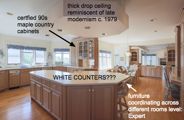
WHITE COUNTERS???