As a lay person / arrogant pedestrian, may I just say: what a shitty infrastructure layout. - When I backed out of street view and looked at sat. images, I 100% thought the paving stone X in the divider was a crossing point. Had to look around in street view to find the 'no crossing' sign. Why the fuck is it even there? Is it a decorative reminder of bygone times when pedestrians were a design constraint? - The necessity of a 'no crossing' sign would seem to indicate that they know people are going to want to cross there. Please don't walk on our affectation of a sidewalk. - In fact, you can clearly see a desire path at the X in Strava heatmap . - While you're there, notice that there seems to be a goodly amount of foot/bicycle traffic in the area. - They very cleverly neglected to put the no crossing signage by the sidewalks, i.e. the point of origin for anyone crossing. Instead, they're only placed on the median. Not exactly a high visibility choice. Especially at night. Fuck it, I'm already in the street. Might as well finish. - It's not like there's a constant in the universe saying that crosswalks can only fall in street intersections. But hey, I guess a poorly deployed no crossing sign is cheaper if not actually safer. Cryptonomicon by Neal StephensonRESPECT THE PEDESTRIAN, the signs say, but the drivers, the physical environment, local land use customs, and the very layout of the place conspire to treat the pedestrian with the contempt he so richly deserves.
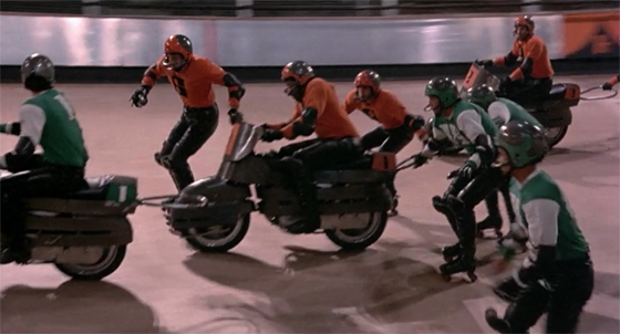
Arizona is its own hell. The majority of the populated areas was laid out post-WWII when air conditioning was a given and cars were fully enclosed. As such, it's the goddamn surface of the moon from a pedestrian perspective. And they're super big on their shitty freeway concrete. Swear to god, nobody gives as much of a fuck what the pattern on a goddamn overpass is as the fucking Arizonians. I guess it's because the urban landscape is an undifferentiated hellscape of brown boxes and branding. Seen Rollerball?
