none whatever, though i side with alexander i have heard that this is a bit of a seminal moment in the field, yes. very interested to hear what you have to say.
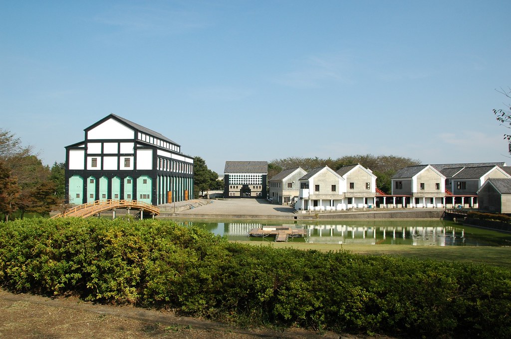
It's hard not to side with Alexander. His built work is meant to be occupied by humans; Eisenman's is not. That's basically the whole deal. The Katarxis gallery you linked by Alexander's student, Michael Mehaffy, is a good example of the care Alexander put into designing these spaces, and not just the design but the construction of his projects. His published works (especially The Battle for the Life and Beauty of the Earth) describe the care he takes in tectonics, the art of construction. Eisenman did not. He designed Wexner with 12,000 square feet of fenestrated galleries which were later refitted because prolonged and unprotected sunlight exposure damages artwork it turns out. He designed House VI just a few years before this debate, and that was a fucking shitshow saved only by the kindness and architectural appreciation of his patrons. I mean, you can already tell the style of the guy when he said Chartres was "boring". My coworker (GSD faculty at the time) said everyone's collective jaws dropped at that considering, well...Chartres looks like this: Just for quick comparison, this is one of Eisenman's most prized works of his career: Which, despite looking like graphing paper ski slopes, also has this going for it: Par for the course for Eisenman - overblown budget, unfinished project, unusable space. This article is scathing. Meanwhile, Alexander's designing Eishin campus with Japanese school children: They ended up with this - no hiccups, no errors, in budget, active client participation, highly functional, highly used. But Eisenman's career took off in the years following this debate while Alexander's languished, and the implications of that are astounding. Design had stopped being about livable spaces, perceptual harmony, humane principles, client's needs, and basic functionality. In that vacuum had entered Eisenman's dialectic, and the academe from which it's derived. By taking a stand for functional harmony vs. post-humanism, Alexander took himself out of modern discourse and Eisenman et al became the lion and the Christian. Design's post-modern positioning can only be understood by that lens.

The project has more than doubled its original budget and has not attracted significant numbers of visitors. Construction of the final two planned buildings was stopped in 2012 and terminated definitively in March 2013 following high cost overruns.
The architectural commission to build this community, came with the explicit insistence, by the managing director of the school, Hisae Hosoi, that he wanted the project to be done under conditions where faculty, staff, and students, were all taking part in the design process. And by this he meant, not the pablum of token "participation" and "charettes" that has become common in the last twenty years, but honest-to-goodness decision making by the people in the school, based on individual and group understanding.

in a way there are two conversations happening here. eisenman has never made what i would call architecture. he makes giant "modern art." this helps resolve the curiosity that no one really likes giant ugly buildings (eg the parisian domino building) but they've won out. there's a prevailing idea that we need giant works of modern art in cities, either for individuality or whatever else. as someone on the ssc subreddit pointed out, it's all very well to fundamentally hate piss christ, because you don't have to think about it. but if you drive by soldier field on the way to work every day... (and in case anyone thinks giant functional stadia can't be attractive, at least concede that minute maid, fenway, etc do a better job of fitting in) interesting links. i think a lot of postwar architecture boils down to an ego trip.
I mean...kind of? The theory behind these "modern art" pieces is wild. Eisenman's collection pulled upon broad depths of theory. People who understand the basis of thought will understand the ego and appreciate the work. I think a clearer distinction is that architects in the modern age are finding a stronger expressive link in their work rather than to the client. That's the distinction I made above between Alexander and Eisenman RE: Eishin vs. House VI. It's also the dynamic of public opinion that KB got at above - in short, public opinion barely matters to whether something gets built or not. In the case of public-facing architecture, the weakening of the non-paying, only-observing client link appears as (and is!) a strengthening of the architect's ego. With public/client opinion backseated, any artist will create with and from what they know, which will always be an ego-expression. There's no way around it.i think a lot of postwar architecture boils down to an ego trip
I think the basic problem is that when we argue architecture should blend into the background, we make it invisible from ourselves. Here's Chicago "then and now." The only people who know the names of a handful of these buildings are the true nerds. Everyone else just notices that a new building went up maybe. Put up something hideous, though? Everyone knows its name.
Splendid succinct recount of architectural differences. Thank you for sharing the glimpse into their world. The City of Culture likes a bad 90s 3D render.