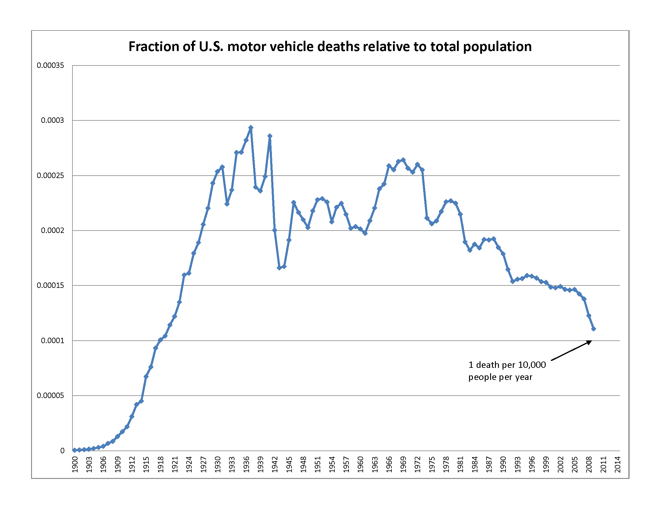
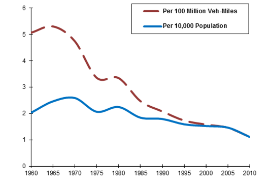
✓ chart shows data from all relevant years, not suspiciously selected years ✓ chart depicts measures that are constant over time (deaths, miles), not indices of a sample population that is in constant flux ✓ chart does not rely on counter-intuitive math ✓ y-axis is zero-based The apparently very good trend shown by the red line is a bit misleading, as the blue line shows rapid growth in number of miles traveled, so we should multiply the two lines together to get the total number of deaths. (It's not much consolation to know that someone drove a lot of miles before being killed in a crash.) We would also want to correct for population change. Wikipedia has the result:
The stats are even better than that if you only factor in newer cars. There has been a lot of safety improvements in the last decade, and some pretty big ones in the last couples years with partial overlap and rollover safety standards. Oh and now with automated/assisted breaking the only thing thats left is staying in your lane, and nor running red lights and even that's getting automated away.

