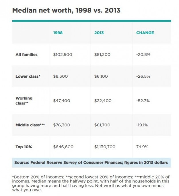
The chart shows the bottom, 2nd, and middle quintiles, skips the 4th and top, and then ads back in the top decile. That doesn't mean there is anything wrong with the data or the conclusions, but it is a red flag too watch out for choosing the results to display based on the east they look. Anyway, it looks about the way you would expect from all the reports about most wages stagnating except at the top, along with a big recession. And it makes sense that the working class would be hardest hit-- they saw a big increase of house buying power in the run up and then got lots of layoffs, many especially in manufacturing. A less quoted fact is that manufacturing has recovered very well if measured in productivity instead of jobs. There has been some increased demand in highly technically skilled work, (jobs in the omitted 4th quintile) and of course the recovery helped the guys on the top floor (top quintile/decile) .
On average, yes. But there aren't many who landed on that average. The engineers or highly skilled operators came out the other side as good or better off, and a whole bunch of workers just couldn't get jobs at all.
I don't think they did... the only group in this chart that is positive is the top 10%... I don't think that's the engineers and highly skilled operators, that's the hedge fund managers and executives.The engineers or highly skilled operators came out the other side as good or better off, and a whole bunch of workers just couldn't get jobs at all.
A) 30% of households are left out of that chart - it skips directly from the middle quintile to the top decile - sketchy reporting there. Those jobs are mostly in that skipped category - above median quintile but below top 10%. B) Engineering/technical manufacturing skills are only a small part of the job market. They could be outweighed by losses in other sectors.
