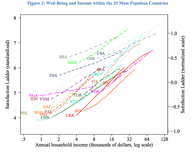
This one is unpackable, though. 1) it's a log scale 2) It's priced in dollars across all countries, not in percentage of average income 3) the log taper starts going linear between $60 and $80k. The article makes the argument that "all these statements are false" when in fact, "all these statements are nuanced" and "a few of them have been misrepresented." HL Mencken put it thusly: "In America, happiness is making $10 more a month than your brother-in-law." He weren't far off.
That was a good one. "Everyone knows" this, and so did I. The Economist has a cleaner chart, and it is striking how well the logarithmic relationship holds. I tried the suggested image search, and think I found the chart the author made fun of, "the one where people who make enough money literally hit the top of the scale. Apparently, there’s a dollar value which not only makes you happy, it makes you as happy as it is possible for humans to be."
I think the more interesting here is the intercountry comparison. For example, the richest group in Japan is slightly less satisfied than America's poor. I wonder if that is reflective of the Japanese being unhappy, Americans being happy, or an incommensurate comparison whereby we understand satisfaction to mean different things. Also, for the mathematically ignorant, a lin-log plot showing a linearity implies a logarithmic relationship, which means that there is a diminishing return on happiness with new money. So it appears the the trope that a little money makes a poor person a lot happier than a lot of money makes a rich person does, in fact, appear to hold across all the countries surveyed, even if there isn't a hard cap beyond which one doesn't get happier with more money.

