The link goes to the Detroit Institute of Arts website where they have an interactive exploration of Diego Rivera's Detroit Industry Murals.
I have been going to the DIA with family, friends and Hubskiers for years. You can't help but marvel at Rivera's murals while there and you also can't help but feeling the very real manufacturing bones that Detroit was built upon. It's everywhere. In the decrepit buildings, the weathered faces of old factory workers, even the science museum has exhibits dedicated to manufacturing, steel fabrication and the production line. Detroit is a special place with a very unique history, much of which is captured in these murals.
Now show me yours
I'm taking some classes on Art History this semester and this piece of art mesmerizes me. Imagine being Thutmose in 1345 B.C.E tasked with creating a likeness of the Queen who is for all intents and purposes a living god at the time. While this is most probably not what Nefertiti looked like this still has huge artistic value. This is an unbelievably stylized version of the her. If you look at these angles you can see just how Thutmose uses everything to extenuate the beauty of the face. He uses the headdress to create this graceful cone shape leading down to her chin. It is physically impossible for a human to have some of her qualities like the nearly perfect line from the front of the headdress to the tip of the nose. If we move onto the face: the high cheek bones, the full lips, the defined jaw line. Then we move down to the really long neck, and the bit of the shoulders that are visible. While from the side the neck looks a little odd if you look straight on it helps to define the jaw even more. From a more artistic standpoint the neck and shoulder adds a sort of asymmetrical balance to the piece as a whole. To me the very idea that a dude in 1345 B.C.E. could capture something in a bust that about 3000 years later would still find unbelievably beautiful. It's inspired me to eventually visit the Neues Museum in Berlin.


Great post, thank you for sharing.To me the very idea that a dude in 1345 B.C.E. could capture something in a bust that we more than 3000 years later would still find unbelievably beautiful. It's inspired me to eventually visit the Neues Museum in Berlin.
It makes you wonder if there is something intrinsic in what we commonly find appealing/attractive? Symmetry is often pointed to as a key indicator of attractiveness. This certainly has that.
Gallery of maps at the vatican. I'm a huge music fan, sometimes really great songs make me feel almost high. This is the first time art made me feel that way. And that's the intention, people would take this hallway on the way to see the pope. By the time you saw him you were very reminded of the church's power.
I was at the MONA in Hobart earlier this year and really enjoyed the exhibitions there. My favourite was: The Depraved Pursuit of a Possum by Tessa Farmer I love the minuteness of it all. The fairies riding the bugs are tiny. The photos don't do it justice of course. It's beautiful if a tad macabre. TF: I think it might be pheromones, and maybe dancing – you know, like how bees dance to communicate where flowers are. Lots of insects communicate through pheromones. Once enslaved, the bee-sting power is sublimated to more sinister use: the torture and destruction of a (taxidermied) Tasmanian brushtail possum. (‘Wouldn’t the wasps evolve behaviours to counteract the predation of the fairies?’ worries Tessa momentarily, before brushing the thought aside). TF: I thought the possum would be quite easy to overcome, but they make these horrific noises and have these big claws. When it actually arrived [from a taxidermist in Launceston], I realised what thick fur it had, and wondered whether the bees would be able to get to the skin of the possum to sting it. It might all be completely futile.


In The Depraved Pursuit of a Possum, the fairies are conquering a bees’ nest. ‘They learnt to control bees in Britain, and they seem to be controlling the honeybees here in Tasmania quite well, too,’ Tessa told me when I spoke to her in June. They are apparently using some sort of unspecified mind-control to do so:
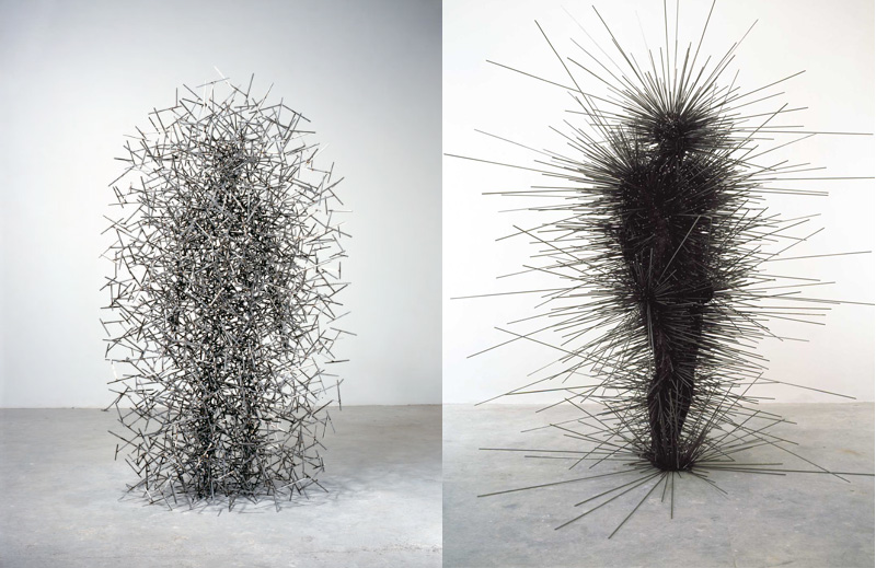
I really dig the Antony Gormley pieces you show here. I also enjoy the Kienholz before piece but it's so disturbing that I can't really say that I 'like' it. Are you sure that Tim Hawkinson only used his fingernails for that sculpture? It looks as though there are some long pieces in there. No toenails?
I just remember seeing the Tim Hawkinson in a book and the material listed was fingernails. Could be some toenails. That's not an important distinction to me. A lot of Kienholz work is raw. I don't think he made anything that was beautiful but I think it's important to look at the truth when it isn't palatable and that's what he did. The line I remember about that piece, The State Hospital, was the figure is trapped, unable to imagine anything other than the reality they're experiencing, thus the neon word bubble. He also has really good pieces about lynching, war and backroom abortion. Fun stuff.
I have a couple of Haeckel prints on my wall, I love that guy. Great scientist, great artist. Some of the radiolarians he drew are just mind blowing, a lot of people I've shown don't even believe they're accurate at first (until I show them photomicrographs and electron microscopy images).
This is done by a guy named Vesalius in the mid 1500s. He's considered my many to be one of the fathers of modern anatomy, one of the first people to question a lot of Galen's accepted wisdom. It's from "De Humani Corporis Fabrica Libri Septem," i.e. "On the Fabric of the Human Body in Seven Books." I love how he draws these bodies without skin, often flayed open to display their deeper anatomy, while still posed elegantly and placed in tangible landscapes. The way he describes the body is also rather beautiful, full of analogies and metaphors.
I dig this. Did you take this photo or did you find it online? I ask because it seems a bit blurry. That said, perhaps that's the artists intent and not a result of the photograph.
That seems to be her style, which is part of why I enjoy her stuff so much. I've always preferred impressionistic styles to more realistic ones.
DeviantART Gallery - lots of muscly hairy naked homo-erotic men ~
This synesthetic artist You can actually see the sounds! It makes so much sense! It's absolutely gorgeous art. Also, John Gould. Saw this at the American Museum of Natural History in NY.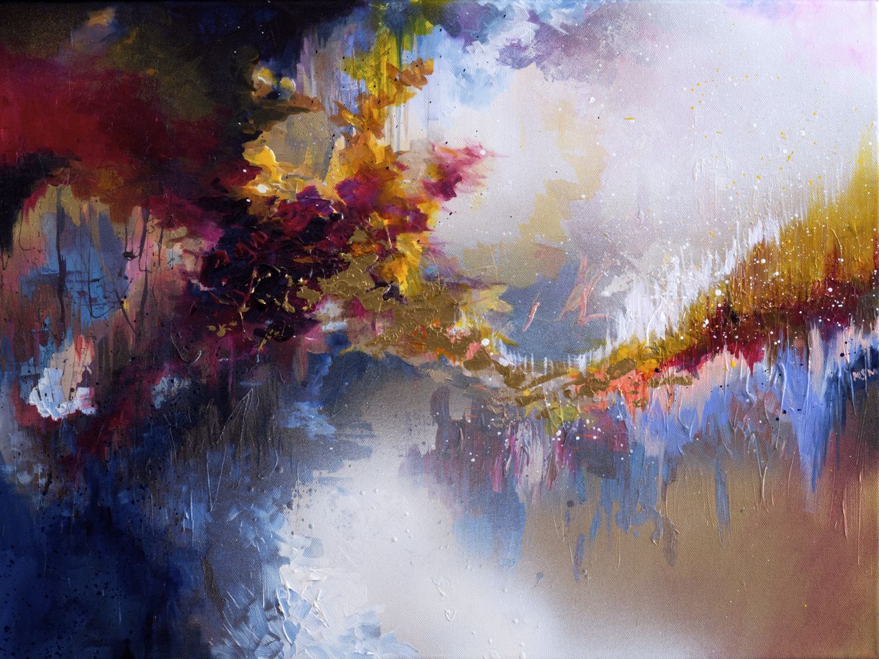
I think the last time Rivera's murals came up, maybe it was a thread by mk, I recommended Thomas Hart Benton's murals. Maybe they're subpar. I don't know. I just really like them and always want to share. That said, and I hate to sound like a plebeian here (thank you spell check), but I really do quite enjoy advertising art. It has everything "real" art has. Color palettes. Composition. Blah. Blah. Blah. It has something though, that I think a lot of art lacks for a guy like me, and that's an understandable message. It's accessible, and for me, that makes it both enjoyable and worthwhile. That's not to say that I don't enjoy looking at a piece by the Dutch Masters for example, but I don't think I should have to take classes in art history to enjoy art. Ads? They're art. They're directed at guys like me. God damnit, I like them.
Oh boy, don't get me started. Here are a few artists I like that I feel are doing well for themselves but you'd miss them if you weren't super into contemporary art. Okay, so you might know these two , but if not, seriously, the last time I was outright blown away by art (jaw hanging open, absolutely speechless) was when I saw their show. All their works are interactive so anything I say here will do them no justice, but let me explain my favourite Storm Room. You walk up a ramp into what looks like a box large box made of plywood. When you get inside however, the inside is modelled like the inside of a rural Japanese dentists office. There are windows and rain pours down outside the room (yes real water). Water leaks from the ceiling into buckets. The thunder and lighting make huge sounds when they go off. The room is so small abandoned you feel insecure in this raggedy place. You know the storm isn't real but damn, you still feel scared, like the roof won't hold. And all this is within a gallery. Seriously check them out. This guy is just plain fun. He recently won the Governor General's award for the Arts in Canada and damn did he deserve it. Most his works takes humorous views about time and capturing single moments. The thing I like most about his work is that everything is super is very carefully made and planned, keeping only the most important information to communicate an idea, and yet each of these minimalist works is based on some chaotic process. In the following A Minute of my Time, December 7, 1998, (22:02-22:03) he used a watterjet to cut a massive steel plate in the exact formation of a line he impulsively drew. The line is messy and chaotic, but the steel is fixed, imposing and solid. Its a great dichotomy. Last one I swear. This guy is a super cool Japanese artist with each work giving you that sense of wonder back. All his works appear to be simple sculptures, but upon a closer inspection, you see that each one has a video hiding on it somewhere, often of water. All about memories and connection with the past and the inherent connection of man to nature. I don't really want to write any more, so I'll just leave these here. http://kenmatsubara.com/WORKS/Storm.mp4 http://kenmatsubara.com/WORKS/Paper1s.mp4 other things I like atm Basquiat, Nam June Paik, Jenny Saville, Irving Penn, Xiao Guo Hui, Matthew Barney, Robert Gober, Anslem Kiefer, David Altmejd, Cecily Brown, Charles Ray, Yoko OnoJanet Cardiff and George Bures-Miller

Micah Lexier

Ken Matsubara
Check out the baby in utero (baby in the bulb) above the entrance. Born in to all of this...


