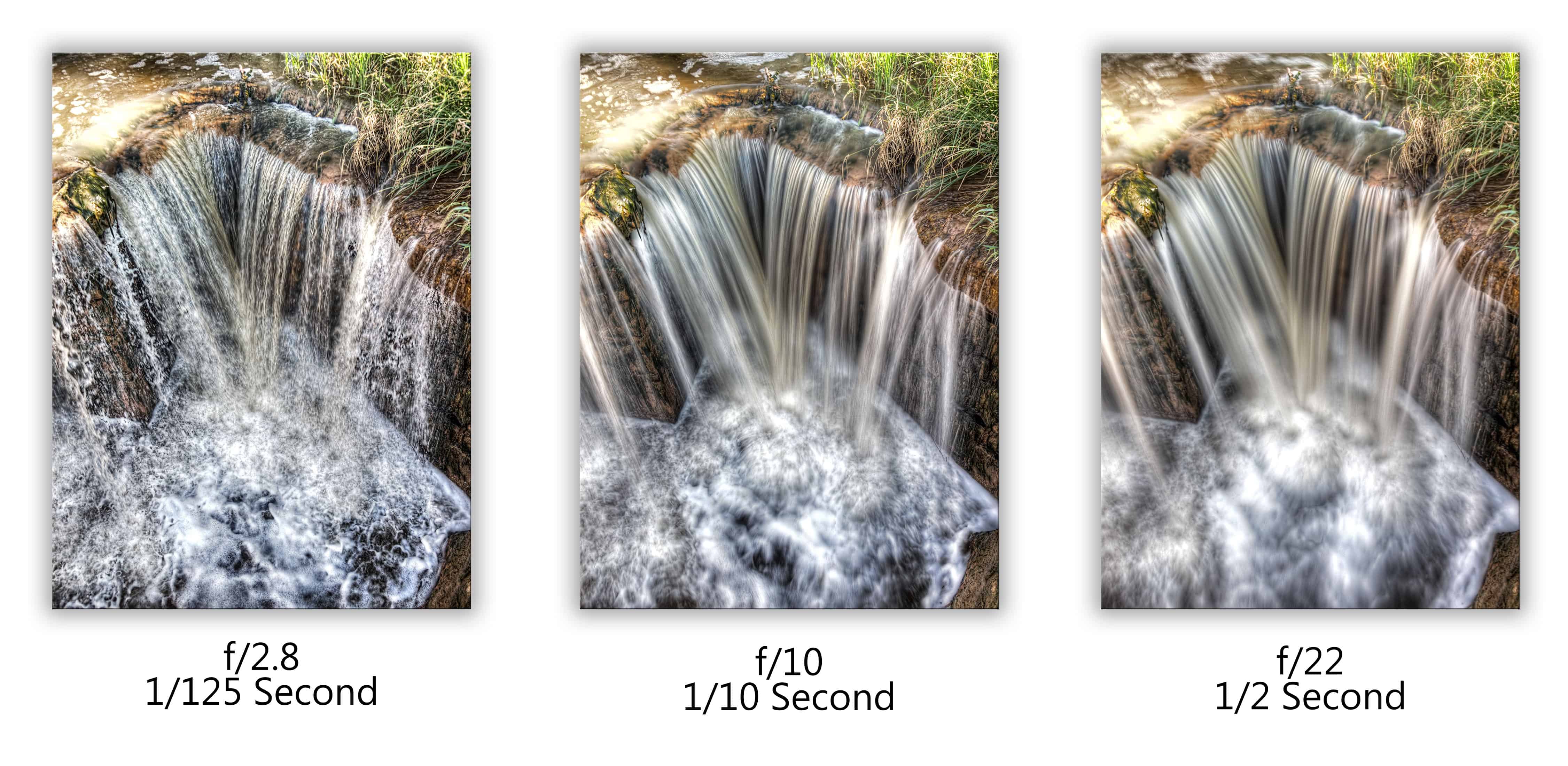
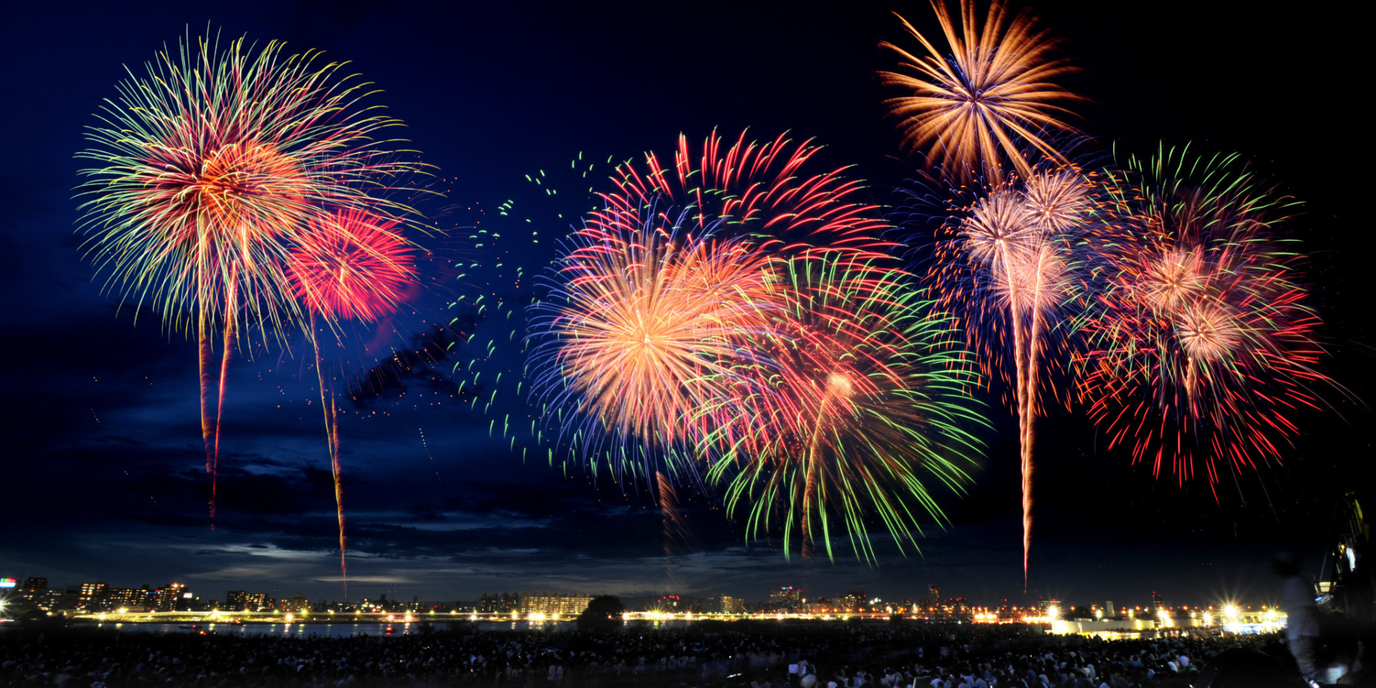
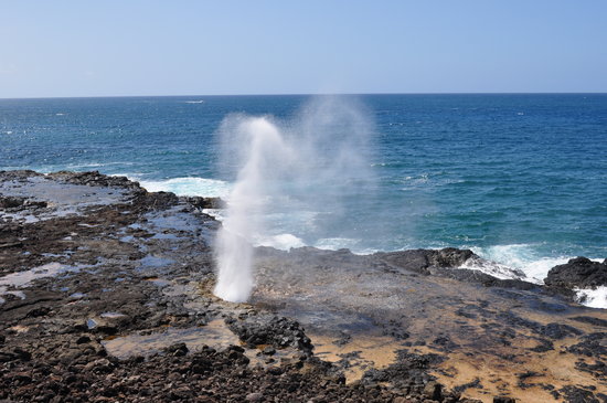
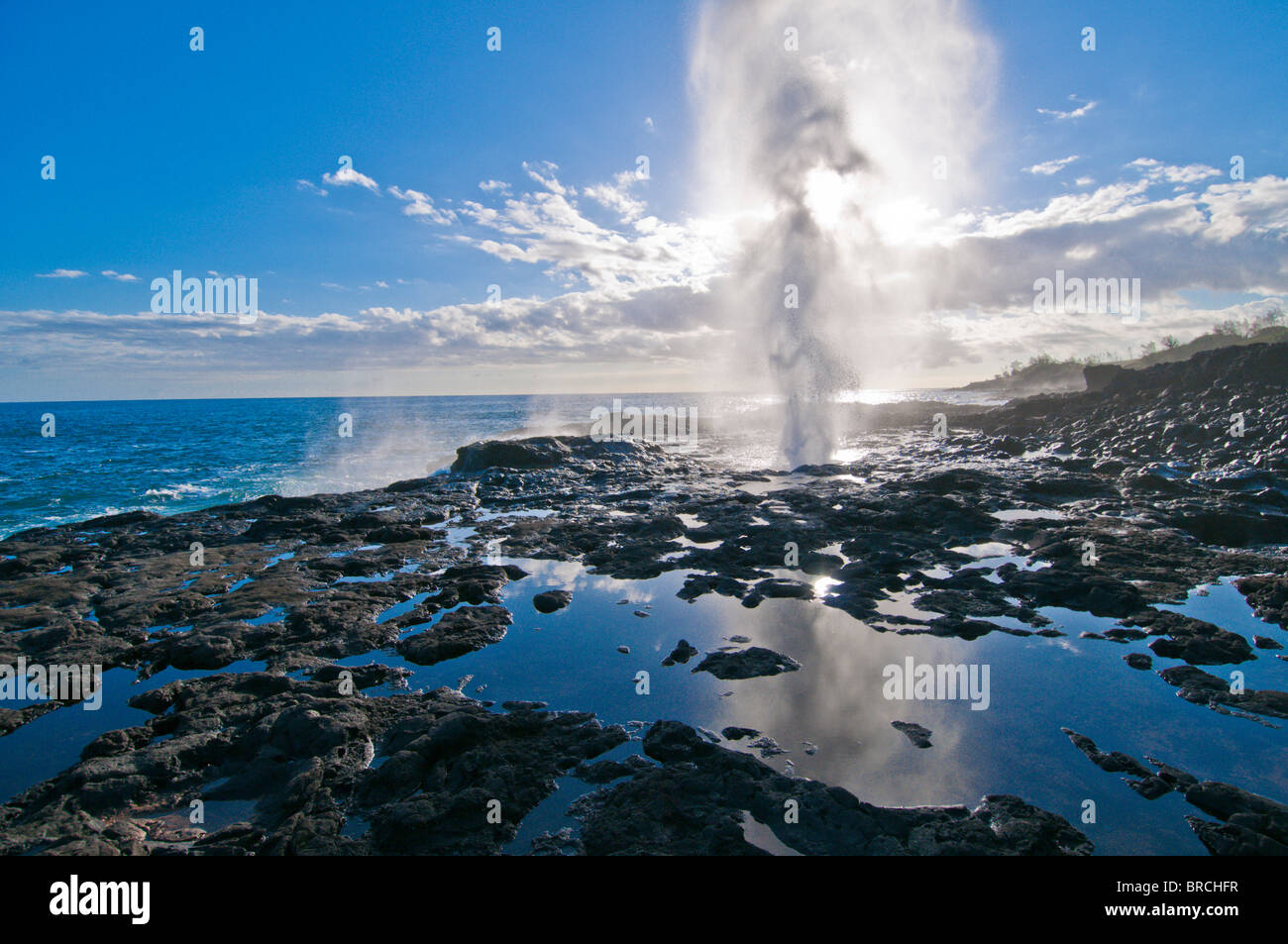
I will happily take your questions. So will others. There are some quotes I like to use unsourced because unfortunately they're mine and I haven't found anyone more authoritative to blame them on, but "photography is the skill of turning perspective into art." BROAD STROKES Fundamentally, a camera is a box with a hole in it. The only two things you really have control over is the size of the hole and how long it stays open. Your camera, regardless of how simple or complex, has four principle modes: P, S, A, M. It may have a bunch of other presets, it might have some dumb mountain, tulip, face, skyline bullshit, but fundamentally, every camera out there gives you - Program priority. This means the camera is choosing the best shutter speed, aperture and effective ISO (film sensitivity). You're 100% reliant on the brains of the camera interpreting the best way to take the picture, and the camera, I don't care if it's a $20k hasselblad, is gonna take the most conservative, most-likely-to-be-okay picture it can. Keep everything in program, and you will have unremarkable shots of everything. - Shutter priority. You have control over how long the hole stays open. The camera will measure the light coming in and adjust aperture and effective ISO to make the shot work. Shutter priority is useful for determining how much action you want in the shot: - Aperture priority. You have control over how big the hole is. The camera will measure the light coming in and adjust shutter and effective ISO to make the shot work. Aperture priority is useful for determining how much depth of field you want in the shot: - Manual priority. The camera will take the picture at exactly the settings you say. This is useful when you're attempting to create something that isn't there, for example: Know how you take fireworks pictures? 1) Put camera on manual with a timer 2) Put camera on tripod 3) Set ISO to crazy low (50-25) 4) Set shutter to 15-20 seconds 5) Get out a black card and hold it over the lens until there's a cool firework, then move the black card and put it back, and expose a few fireworks all at once. That's 90% of it. Those are the two real things you have control over - how long the hole stays open and how big it is. Everything else is details. If you're shooting sports, shutter priority is probably good. If you're shooting nature, aperture priority. If you're shooting night skylines, probably manual, undoubtedly on a tripod. MORE NUANCED STARTING POINTS - rule of thirds. Don't center your shit unless you really, really mean it. Really, just go do a google image search on "rule of thirds." It's one of those things you can't unsee and you didn't even know. - leading lines. Another great Google search. - Perspective control. A lot of which you can do in Lightroom (Lightroom has lens correction for nearly every fucking lens on the planet) but if you can do it in-camera so much the better. You probably know tilt-shift from bullshit like this: But these lenses were created for bullshit like this: In professional architectural photography, horizontal lines can be any which way but vertical lines are always vertical. Walls are perpendicular to the ground. Full stop. - golden hour. You don't have to shoot everything an hour after sunrise or an hour before sunset, but the 4 hours surrounding noon are fucking useless for photography and the four hours on either side of that are challenging. Obviously if you won't be back when the light doesn't suck, take the picture now... but if you can come back when the light doesn't suck... I mean, here's Spouting Horn on poipu beach, Kauai. Tripadvisor's finest. Here's Spouting Horn at magic hour. And obviously there's other trickery going on which extends to the full bag of chips. Here's Spouting Horn when you get there a little after sunset and decide that it's a really unimpressive geographical feature but you need to get something out of it for your time: PORTFOLIO CRITIQUE Thanks for sharing your portfolio. It affirms what I suspected - you have a good eye but are inexperienced with some of the easy things you can do to improve things. You can literally take some of these, feed them into Lightroom and learn. Cabinets are vertical. ALWAYS. If you have a decent wide-angle lens this is less of a problem. If you have a perspective control lens it's a non-issue. If you have Lightroom you can fix it. Also, your focal point is the microwave when in fact you're selling tile here; the next time you take this shot, you want whatever makes the stonework look awesome. The window blew you out. You can mask this in Lightroom and color balance it to match. Alternatively, you put it on a tripod, shoot once for inside, shoot once for outside and HDR that shit into one photo. Also, take it lower or higher so that the backsplash/counter is more prominent than the cabinets. You aren't selling cabinets. Lighting is flat and the soap dish is distracting. If you were to take this shot again, you'd remove the soap dish, you'd make sure you had legal right to reproduce the art piece (or remove it and replace it with a better prop) and focus the shit out of the sink. I might even hit that with a light that's been flagged off to accentuate it. This is a tricky one. If you wanted to make that stonework look good you'd wanna hit it with crazy bright lights at night with whatever cityscape you can find behind it. As it is, it looks kinda dingy. This is more like it. Fill flash would be handy. Very Jack Leigh. Behold. Magic Hour. Crop to rule of thirds and perspective control vertical lines to vertical.


